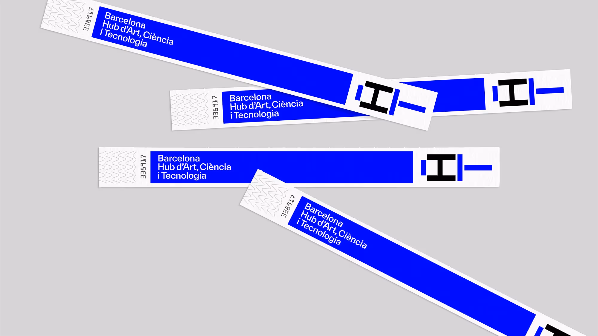
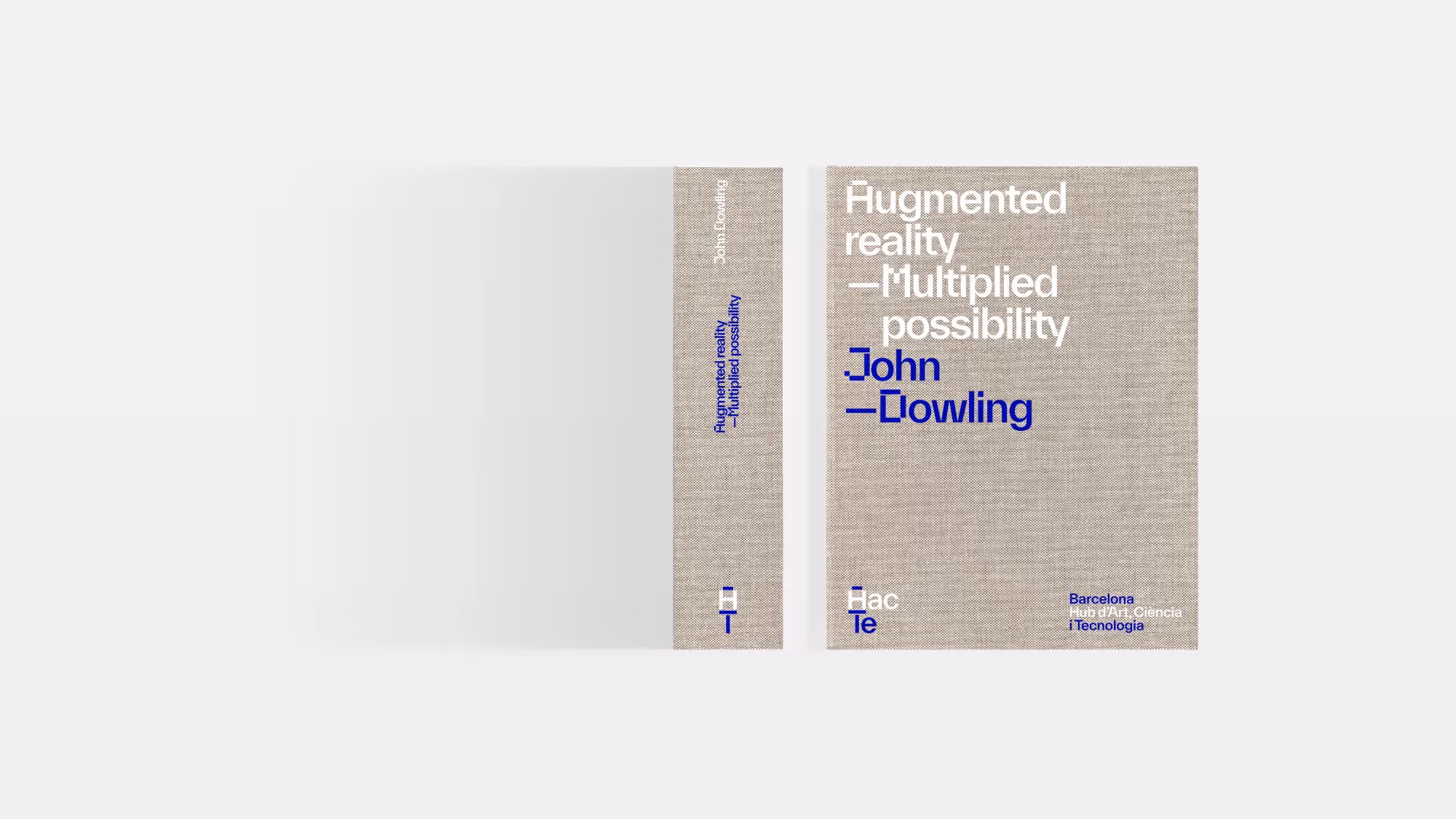
Hac Te is Barcelona’s new Hub focused on the exploration and development of the intersections between Art, Science and Technology. The Hub is a result of the coming together of nine institutions, striving to make the city a global centre for research, training, dissemination, transfer and production in these fields.
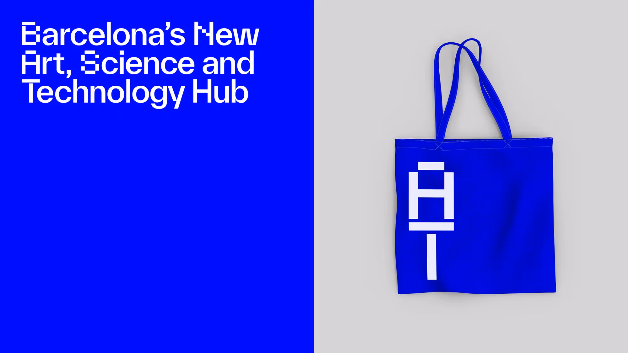
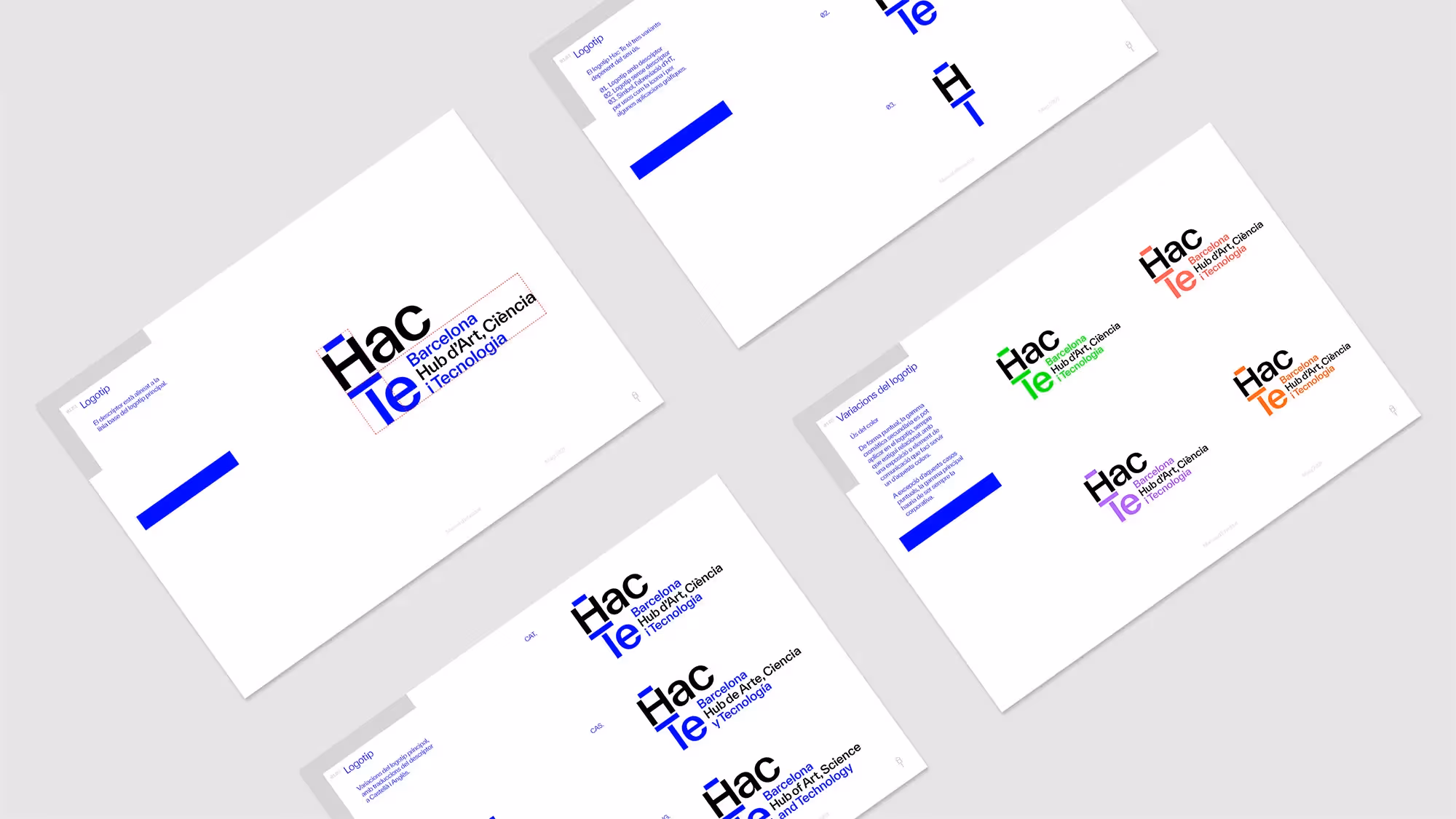
The Barcelona Hub d’Art, Ciència i Tecnologia was reduced to Hac Te, a name which works as both a play between a descriptive acronym and the letters H and T in Catalán. Together, Hac Te phonetically makes a hint at the word hacked.
Hac Te’s visual language is centred on the concept of digital transformation, expressed graphically in a duality representing the amalgamation of Art and Technology. This duality is present in the logo, designed to represent both the Hub and Art, and is also part of the brand’s communication, which uses contradictory concepts beginning with H and T to describe it.
As part of the brand identity, we designed a secondary display typeface. Based on the form of the logo’s H character, the typeface is designed as a hybrid of sans-serif and pixel, aimed to compliment the visual language whilst making reference to early digital technology.


Usted
Mucho Barcelona