Branding and packaging for small Italian olive oil producers, Paolo Miceli and Sergio Sensat.
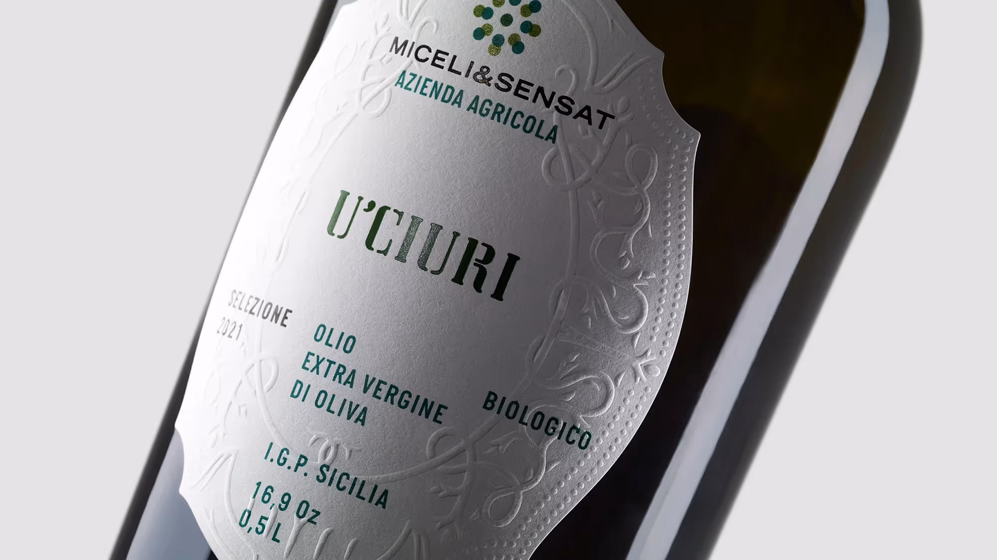
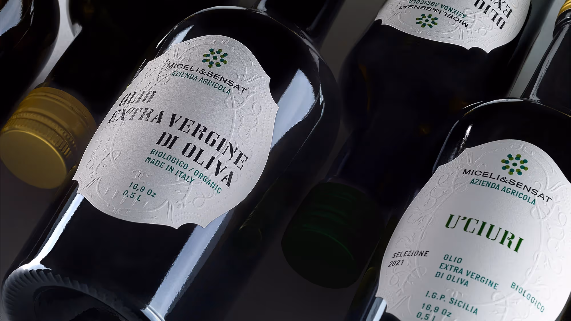
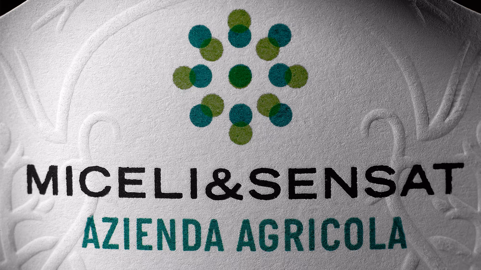
The symbol is created by two dot grids set in two different shades of green that when overlapped generate a new green: the sum of both colors, representing the two founders’ complementary characters and desire to generate something new.
When approaching the label, a couple of things were clear to us:
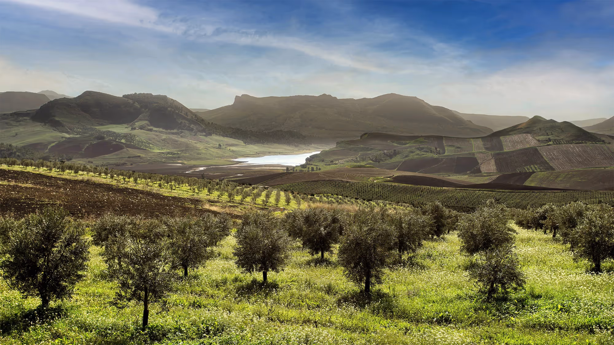
The design should feel Italian – rooted in history. The same history and vernacular that is often seen in Sicily.
Conversely, the founders are newcomers so they cannot make this feel like a traditional Sicilian olive oil. Even though Paolo’s family has been in the region for 10 generations, they were unwilling to claim a heritage that is too often used as a sales proposition, but wanted to somehow represent that deep knowledge and love for history in the island. Instead, they decided to bring a fresh eye when it comes to making olive oil on the Island.
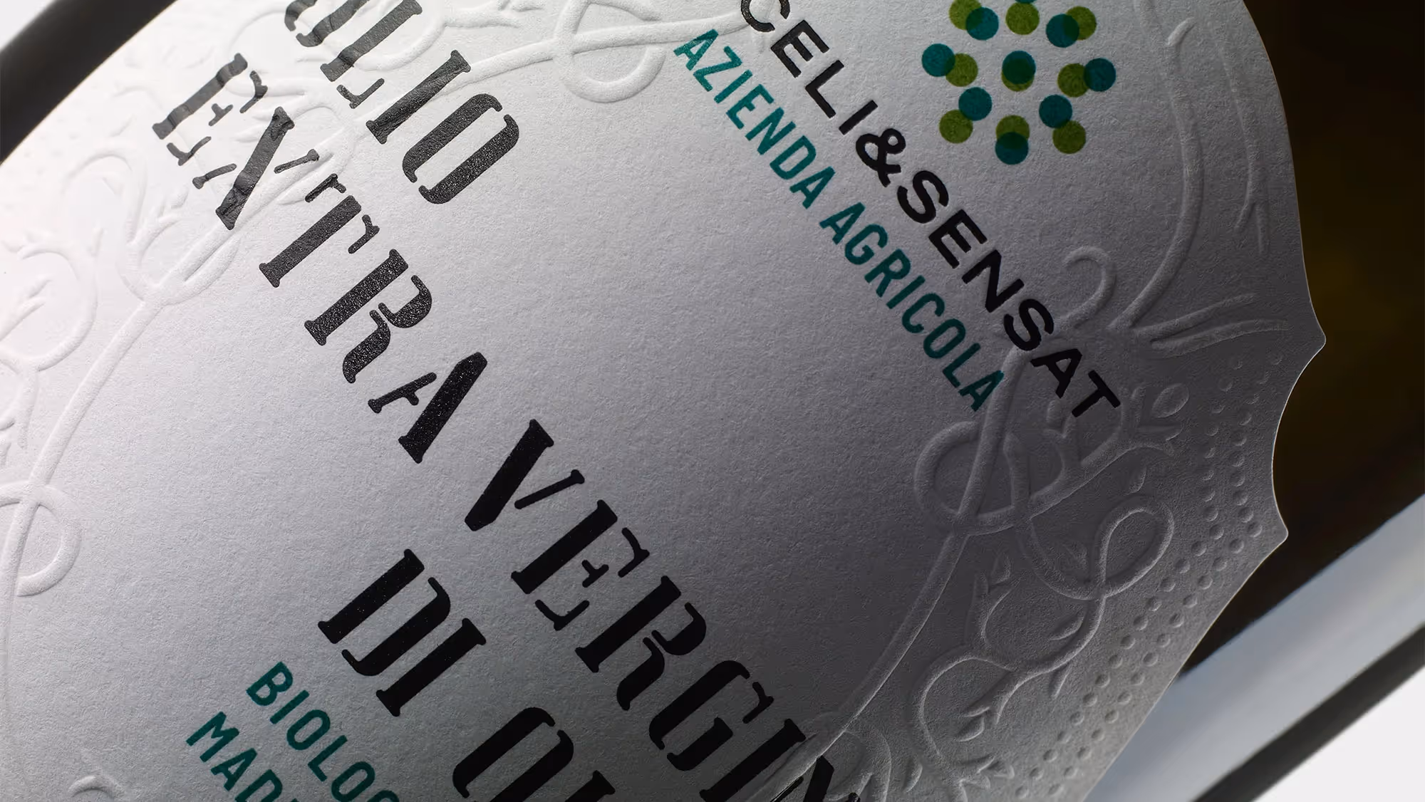
We decided to overprint layers of traditional elements –typefaces, embossings, and treatments– to create a contemporary take on Sicilian history. Constructing a label that combines influences that were never meant to be together, somehow seems to create a unique personality that works seamlessly.